ritzcarlton.com
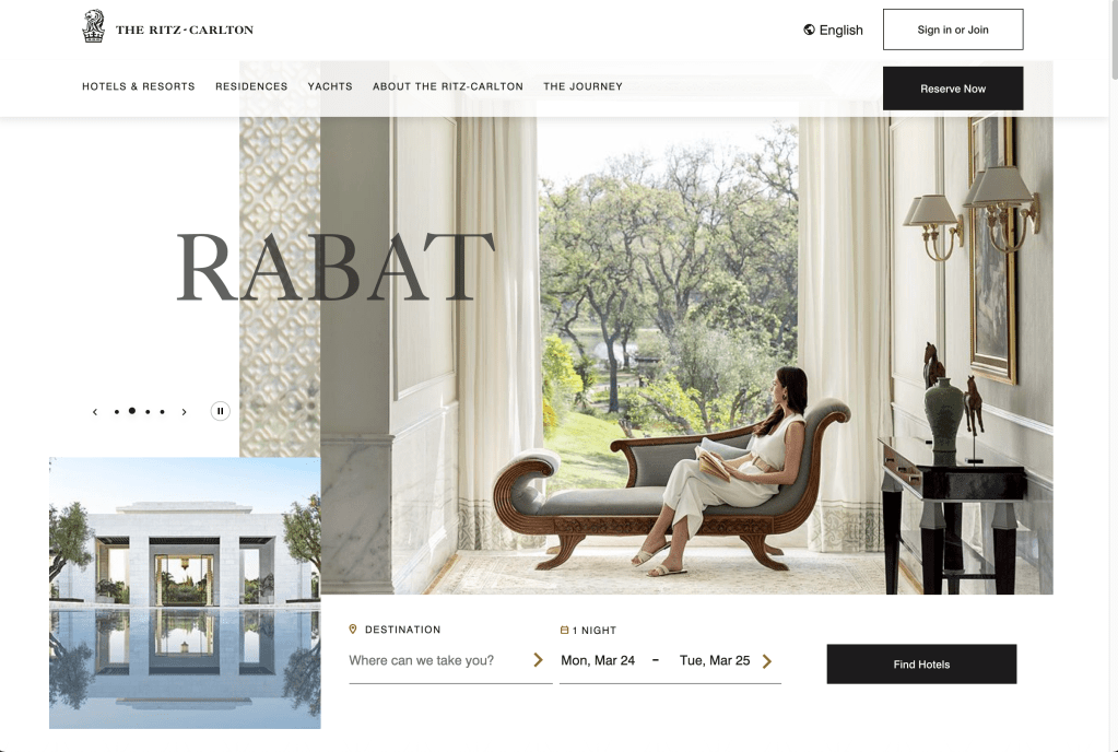
Ritz Carlton’s website breaks the grid, which I feel is very interesting. All the competitor websites use center aligned layouts for their splash page upon landing, so I feel that having a layout that is different but still readable can have Spa Lale stand out from the rest of the competitors.
manoloblahnik.com
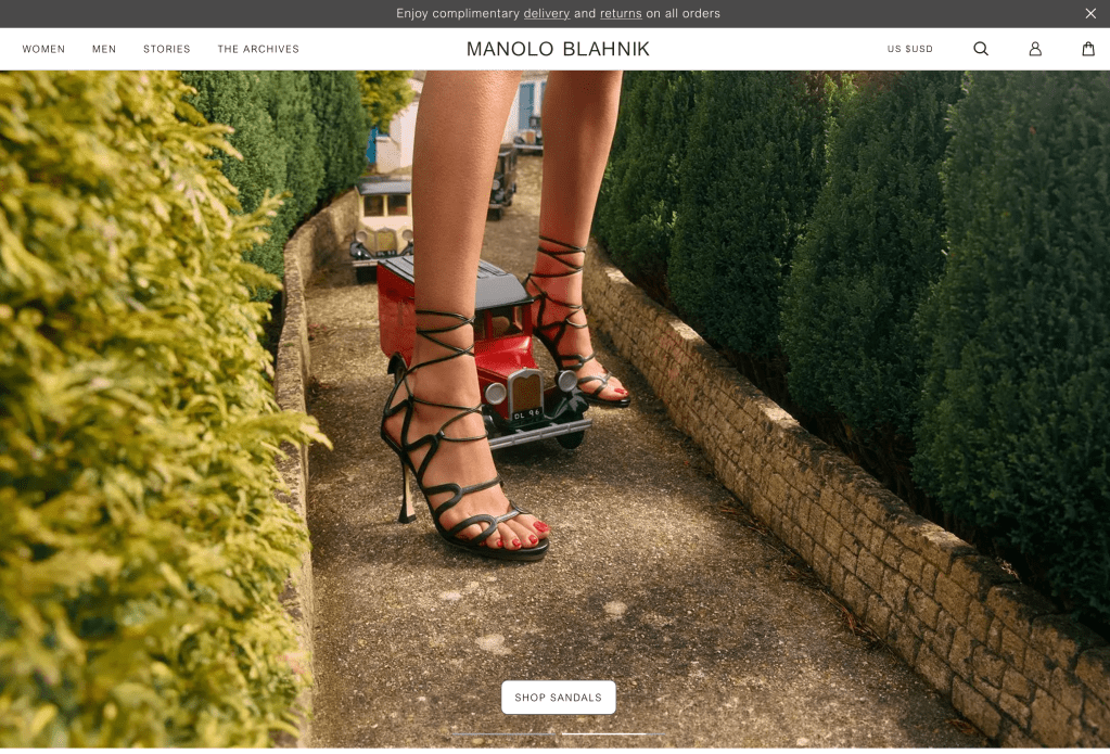
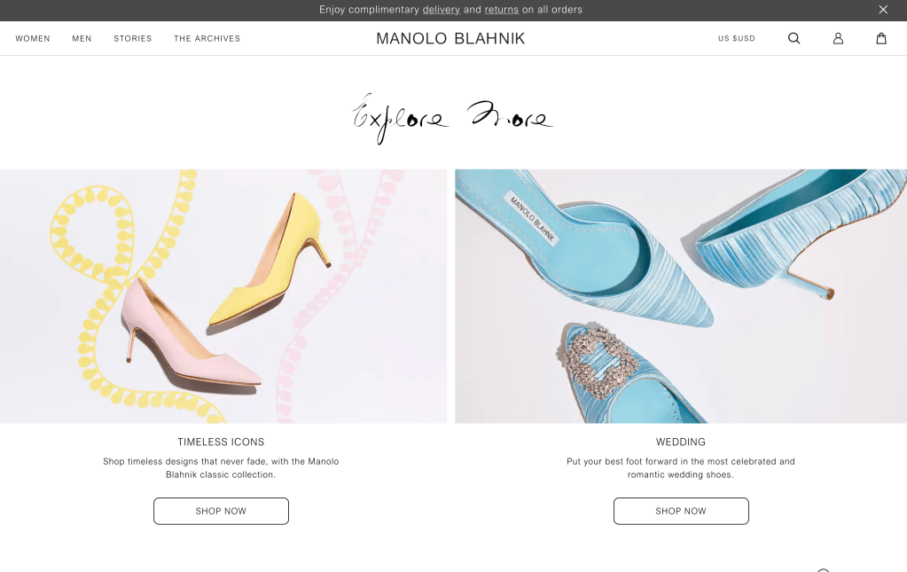
Manolo Blahnik has splash image that piques interest, and displays their products immediately after. Perhaps instead of displaying the services at the bottom of Spa Lale’s page with just images, we can take from this website’s redundant navigation. Manolo Blahnik’s new product categories near the middle of the page also link directly to each respective categories in the shopping page, instead of just to the shopping page itself, so that’s something to learn from them.
www.goyard.com
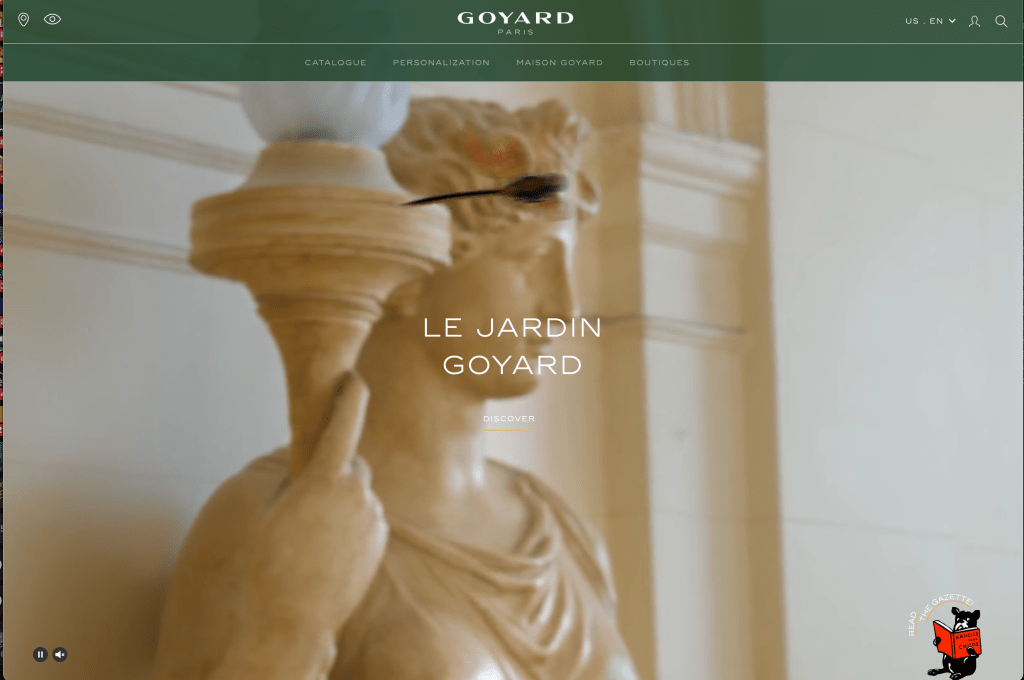
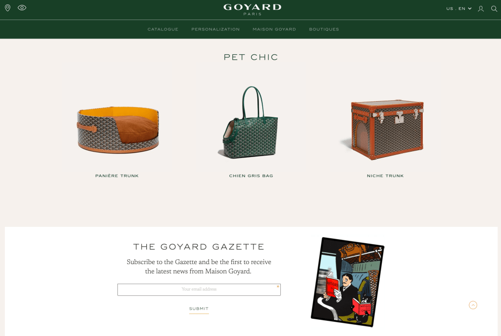
Goyard has the same kinds of redundant navigation as Manolo Blanik, but this site uses typography that reflects a sense of luxury and quality. Combine that with a video that shows a story and this site’s minimal elements becomes captivating. Perhaps picking a typeface that has the thin sans serif for the title will extend the luxury feel that Spa Lale would be going for, or we can imitate the stroke contrast of Goyard’s logo for a more grand luxury feel instead.
