themurietainn.com
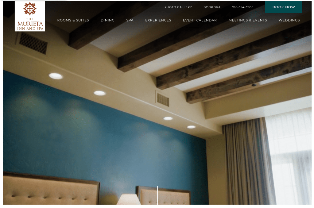
Their site has clearer typography and shows their hotel’s services immediately. Even though their typeface is thin like Spa Lale’s current face, the size is big enough that it is easy to read. The fact that they show the services of the hotel as video is good alone, but they also have a line animation at the bottom of the video going down to indicate to the user that there is more below the page as they are captivated by the video, which I really like.
sawyerhotel.com
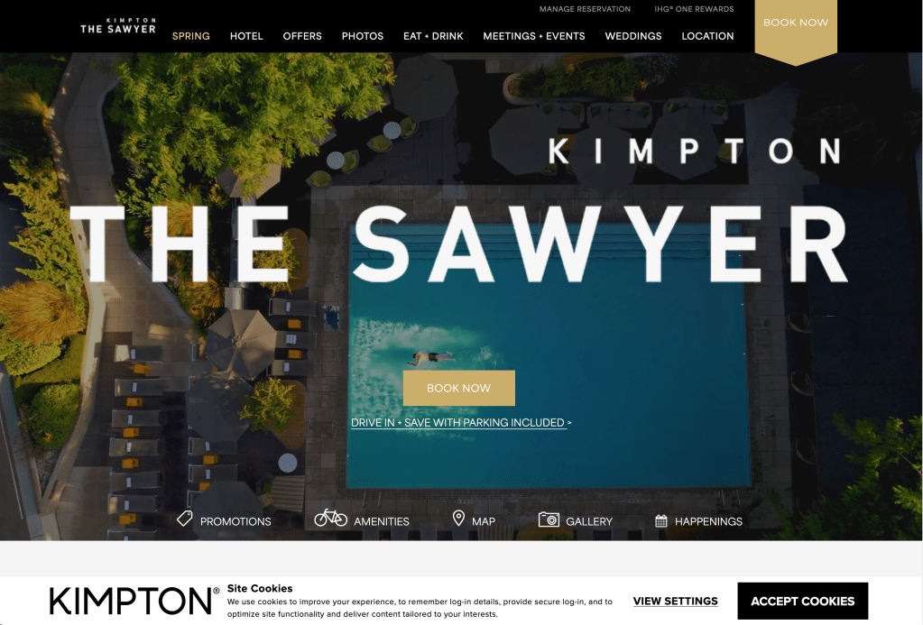
Sawyer hotel has redundant navigation to various categories, alongside showing their booking link immediately where the homepage loads. The Sawyer’s use of yellow underline and bold text for hyperlinks to their various services create a smooth experience of users finding what they need while reading what the hotel is all about.
innatparkside.com
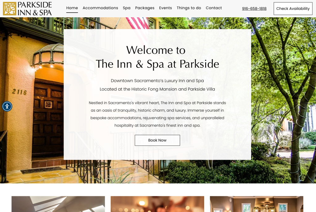
Parkside’s homepage feels a lot like Spa Lale’s homepage in terms of design elements. They both have the same starting composition with white textbox on top of a background image. The difference however is that Parkside has more readable type and buttons that navigate to each of the important categories from the homepage directly, as well as on the navigation bar. Spa Lale could use the redundant navigation from this page.
